Placeholder components
Let’s build some nice loading states in React using a placeholder context.
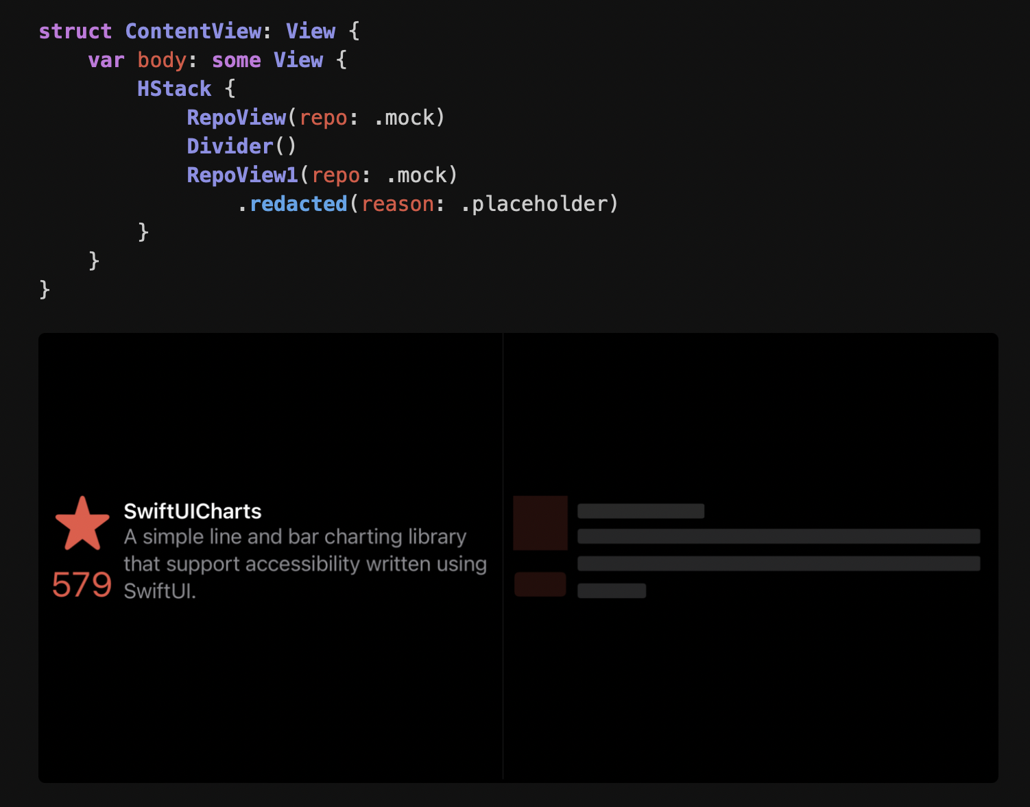
One of the coolest APIs I’ve seen in recent history is the SwiftUI
redacted modifier. In the following SwiftUI example, a RepoView component is rendered twice in a column layout. The left has an icon and some text while on the right is the same component with the redacted modifier: turning the images and text into rectangles which take up roughly the same amount of room as their original counterparts.
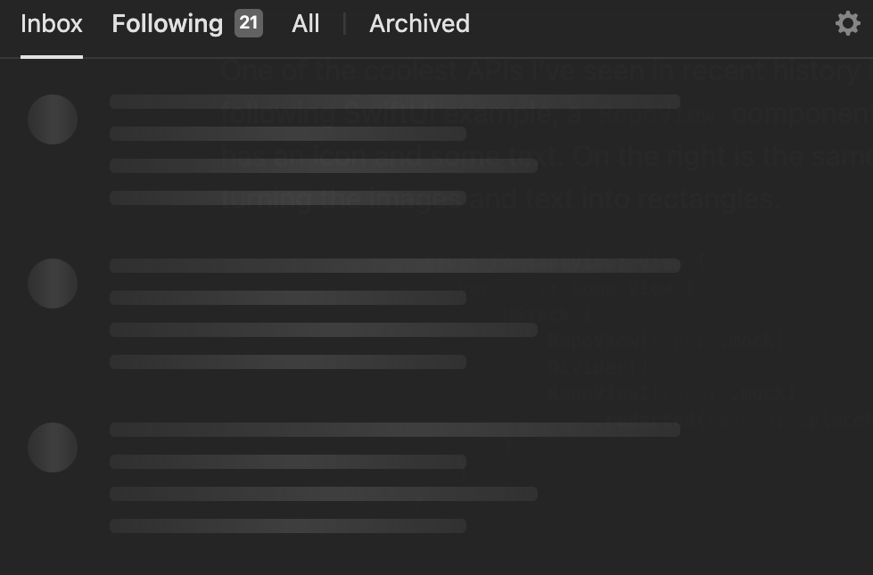
This is useful not only when “redacting” information but also as a placeholder. In Notion, clicking “All updates” has to do a bit of fetching. In the meantime, the user is presented with the following “placeholder” UI elements - even just briefly - to give the user expectations of the information they are about to see. A bit more pleasing to the eye than a spinner (and less jarring when the information actually appears).
We can implement a similar API with React. Consider some basic components for text and images - things that we’d like to turn into rectangles. The props these components take shouldn’t be too surprising to you: some content and colors mostly.
const Text = ({
  children,
  fontSize,
  color,
}) => {
  return (
    <span
      style={{
        fontFamily: "sans-serif",
        fontSize,
        color,
      }}
    >
      {children}
    </span>
  )
}

const Image = ({
  alt,
  src,
  size,
  borderRadius,
}) => {
  return (
    <img
      src={src}
      alt={alt}
      style={{
        borderRadius: borderRadius,
        width: size,
        height: size,
      }}
    />
  )
}
And maybe a couple flexbox components to help us with layout.
const Row = ({
  gap,
  alignItems = "flex-start",
  children,
}) => (
  <div
    style={{
      display: "flex",
      alignItems,
      gap,
    }}
  >
    {children}
  </div>
)

const Column = ({
  gap,
  alignItems = "flex-start",
  children,
}) => (
  <div
    style={{
      display: "flex",
      flexDirection: "column",
      alignItems,
      gap,
    }}
  >
    {children}
  </div>
)
Naturally these components can be composed to accomplish something similar to the
RepoView component above.
const RepoView = ({
  name,
  description,
  imageUrl,
  imageAlt,
  stars,
}) => (
  <Row gap={12}>
    <Column alignItems="center" gap={4}>
      <Image
        src={imageUrl}
        alt={imageAlt}
        size={48}
        borderRadius={4}
      />
      <Text fontSize={20} color="orange">
        {stars}
      </Text>
    </Column>
    <Column gap={2}>
      <Text fontSize={20} color="#eee">
        {name}
      </Text>
      <Text fontSize={16} color="#ccc">
        <div style={{ maxWidth: 300 }}>
          {description}
        </div>
      </Text>
    </Column>
  </Row>
)
And we can display a couple of ‘em
<Column gap={20}>
  <RepoView
    name="98.css"
    description="A design system for building faithful recreations of old UIs"
    stars={6600}
    imageUrl="https://jdan.github.io/98.css/icon.png"
    imageAlt="a pixelated up arrow on a button"
  />
  <RepoView
    name="isomer"
    description="Simple isometric graphics library for HTML5 canvas"
    stars={2800}
    imageUrl="https://user-images.githubusercontent.com/287268/170883272-a93888fc-aa9e-43a8-b01a-b9e7edc9bd6b.png"
    imageAlt="three colored columns sitting atop a gray base"
  />
  <RepoView
    name="tota11y"
    description="An accessibility (a11y) visualization toolkit"
    stars={4900}
    imageUrl="https://khan.github.io/img/tota11y.png"
    imageAlt="white sunglasses on a rainbow background"
  />
</Column>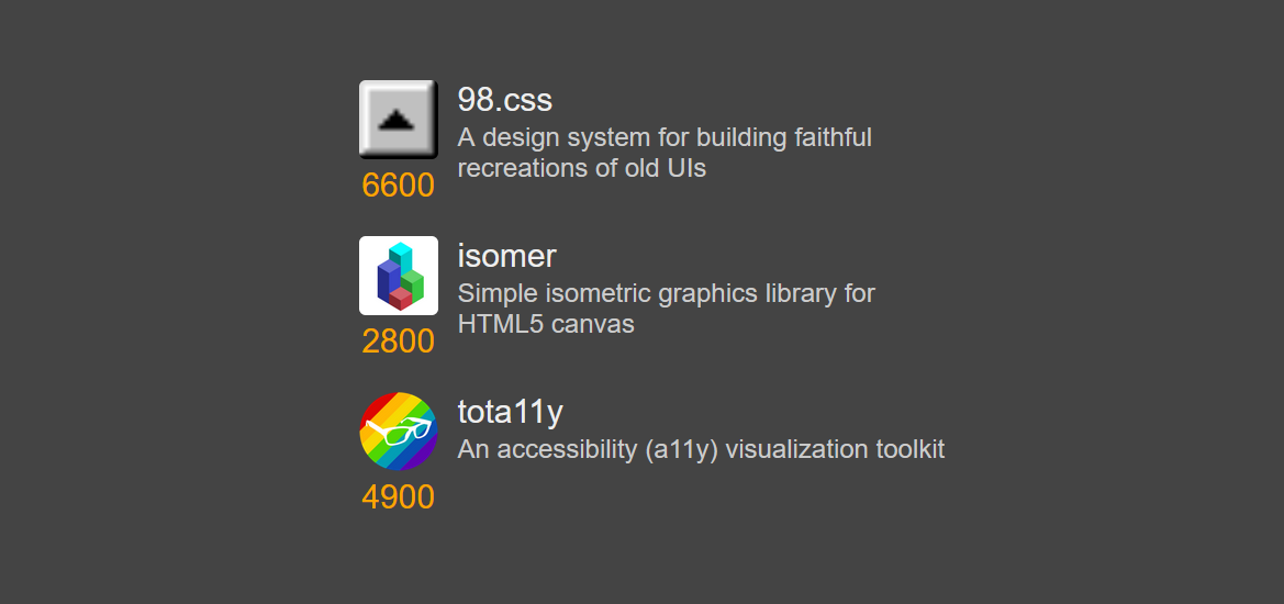
To turn these into “placeholders” it might be appealing to add an
isPlaceholder prop when necessary. We can certain use this to do what we want.
const Text = ({
  children,
  fontSize,
  color,
  // New prop
  isPlaceholder,
}) => {
  return (
    <span
      style={{
        fontFamily: "sans-serif",
        fontSize,
        color,
        // Placeholder styles
        ...(isPlaceholder
          ? {
              opacity: 0.5,
							borderRadius: 4,
              background: color,
              userSelect: "none",
              pointerEvents: "none",
            }
          : undefined),
      }}
    >
      {children}
    </span>
  )
}
But notice we would then need the composite components to be placeholders as well.
const RepoView = ({
  name,
  description,
  imageUrl,
  imageAlt,
  stars,
  // New prop
  isPlaceholder,
}) => (
  <Row gap={12}>
    <Column alignItems="center" gap={4}>
      <Image
				isPlaceholder={isPlaceholder}
        src={imageUrl}
        alt={imageAlt}
        size={48}
        borderRadius={4}
      />
      <Text
        isPlaceholder={isPlaceholder}
        fontSize={20}
        color="orange"
      >
        {stars}
      </Text>
    </Column>
    <Column gap={2}>
      <Text
        // My goodness how much more of this??????
				//
				// 🔥🔥🔥🔥🔥🔥
        isPlaceholder={isPlaceholder}
        fontSize={20}
        color="#eee"
      >
        {name}
      </Text>
You can imagine this process repeating.
Instead of this “prop-drilling” we can make use of
 React Context to access the placeholder information from an arbitrary ancestor.
React Context to access the placeholder information from an arbitrary ancestor.
Start by creating a new context at the top of our file.
false corresponds to the default value: we are not a placeholder when the context is missing.
const PlaceholderContext =
  React.createContext(false)
We cam consume it from our base components with
useContext.
const Text = ({
  children,
  fontSize,
  color,
}) => {
  // No props, only context!
  const isPlaceholder = React.useContext(
    PlaceholderContext
  )

  return (
    <span
      style={{
        fontFamily: "sans-serif",
        fontSize,
        color,
        ...(isPlaceholder
          ? {
              opacity: 0.6,
              borderRadius: 4,
              background: color,
              userSelect: "none",
              pointerEvents: "none",
            }
          : undefined),
      }}
    >
      {children}
    </span>
  )
}

// For images, we'll bail early and draw
// a rectangle
const Image = ({
  alt,
  src,
  size,
  borderRadius,
}) => {
  const isPlaceholder = React.useContext(
    PlaceholderContext
  )

  if (isPlaceholder) {
    return (
      <div
        style={{
          borderRadius: borderRadius,
          background: "#eee",
          width: size,
          height: size,
          opacity: 0.5,
        }}
      ></div>
    )
  }

  return (
    <img
      src={src}
      alt={alt}
      style={{
        borderRadius: borderRadius,
        width: size,
        height: size,
      }}
    />
  )
}
We then “provide” this context with
PlaceholderContext.Provider.
<PlaceholderContext.Provider
  value={true}
>
  <Column gap={20}>
    <RepoView
      name="98.css"
      description="A design system for building faithful recreations of old UIs"
      stars={6600}
      imageUrl="https://jdan.github.io/98.css/icon.png"
      imageAlt="a pixelated up arrow on a button"
    />
    {/* ... */}
  </Column>
</PlaceholderContext.Provider>
Notably: The definition of RepoView has not changed.
<RepoView> doesn’t provide or consume the context: it doesn’t even know about it! And that’s the point.
Let’s see our placeholders in all their glory.

And since it’s all react, we can have our provider respond to state changes like any other node in our tree.
export default function Home() {
  const [isPlaceholder, setIsPlaceholder] =
    React.useState(false)

  return (
    <main
      style={{
        maxWidth: 550,
        margin: "80px auto",
      }}
    >
      <PlaceholderContext.Provider
        value={isPlaceholder}
      >
        <Column gap={20}>
          <button
            onClick={() =>
              setIsPlaceholder(
                !isPlaceholder
              )
            }
          >
            Toggle
          </button>

          <RepoView
            name="98.css"
            ...
          />
				</Column>
      </PlaceholderContext.Provider>
    </main>
  )
}
While (arguably) not as elegant as
.redacted(...), I find wrapping the components you need with <PlaceholderContext.Provider> to be fairly inoffensive. We can of course abstract this away if we so desire.
const Redacted = ({ children }) => (
  <PlaceholderContext.Provider value={true}>
    {children}
  </PlaceholderContext.Provider>
)
And, finally, our loading state. We render actual
RepoViews, we just do so under a “I’m a placeholder” context.
const LoadingRepos = () => (
  <Redacted>
    <Column gap={20}>
      <RepoView
        name="This will be redacted"
        description="We can put whatever we want here!"
        stars="1111"
        imageUrl=""
        imageAlt=""
      />
      <RepoView
        name="Shorter"
        description="Let's make our descriptions feel more organic by giving them a variable length"
        stars="1111"
        imageUrl=""
        imageAlt=""
      />
    </Column>
  </Redacted>
)
Anyway, just an interesting use of context that I wanted to share.