Away Messages
Over the past few days I’ve been working on my love letter to instant messaging – away.jordanscales.com. It lets you write away messages using a composer similar to the one AOL provided with its AIM software. Give it a whirl.
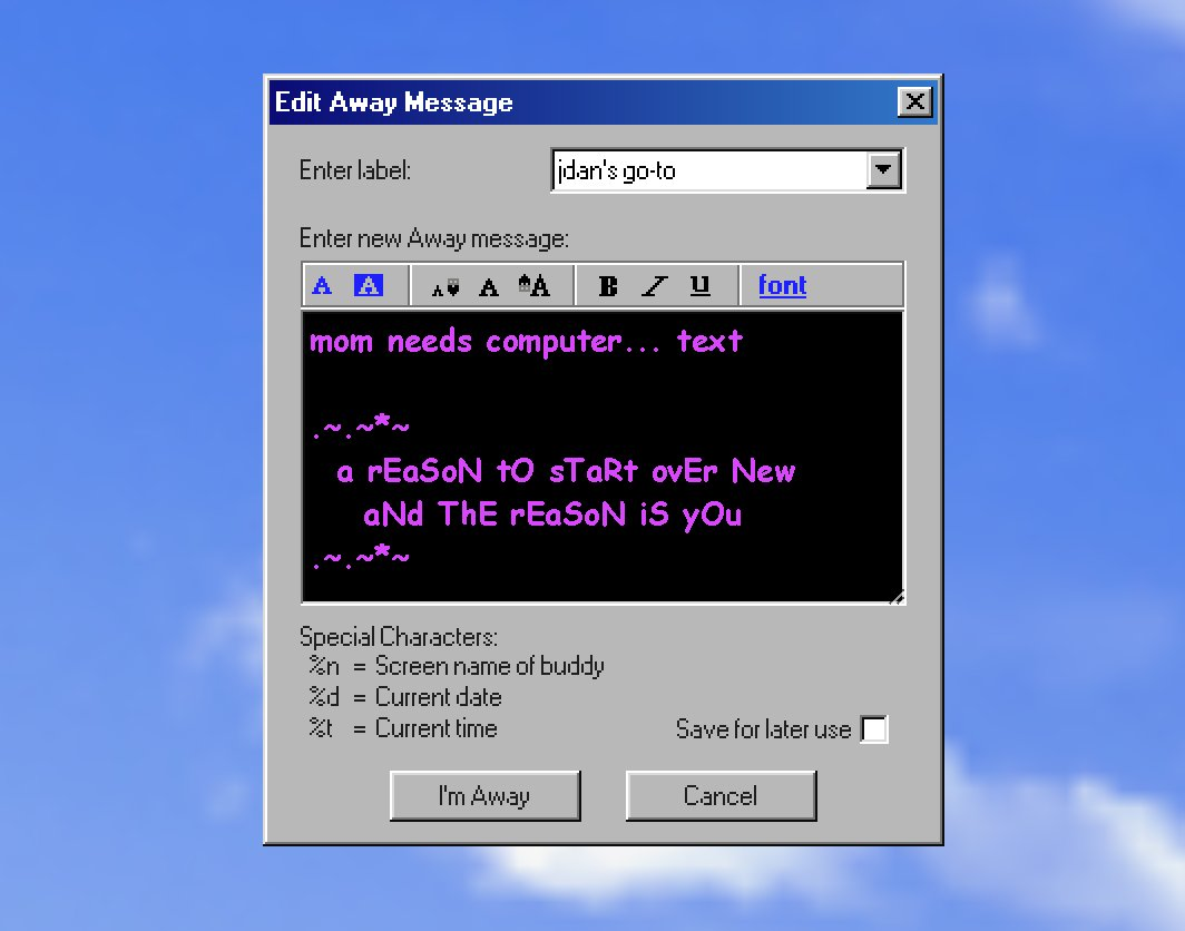
I dipped my toes into retro computing monuments with
 98.css, and about two years ago used it to make a basic Away Message dialog on Glitch – https://away-message.glitch.me/.
 98.css, and about two years ago used it to make a basic Away Message dialog on Glitch – https://away-message.glitch.me/.
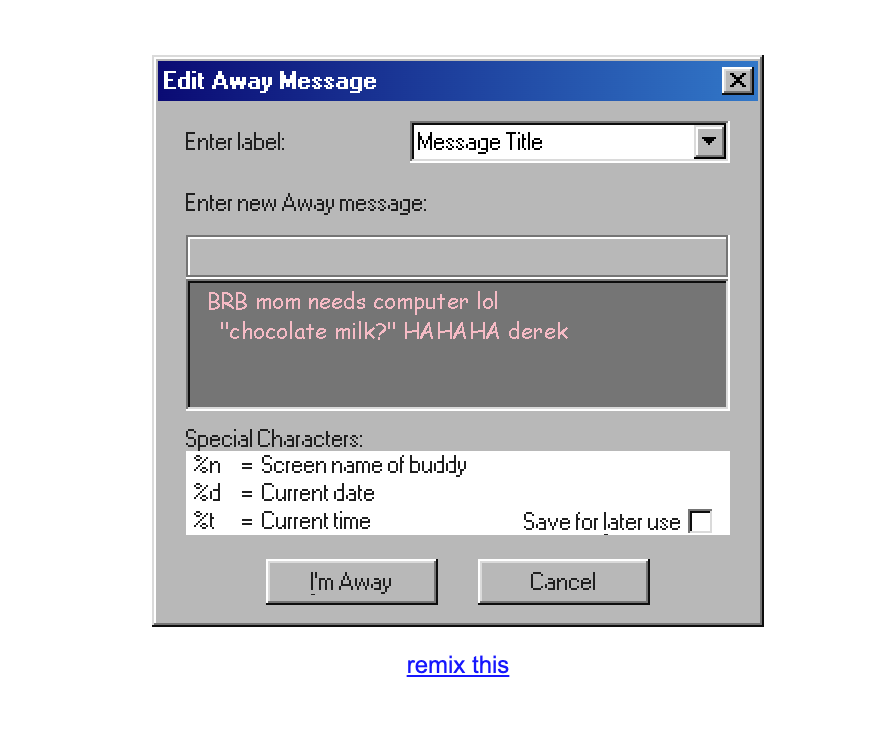
It’s just a ContentEditable, with no way to customize much. Why? Turns out AIM’s away message composer is a rich text input. I work on a text editor all day at
 Notion and didn’t feel a strong urge to build one in my spare time.
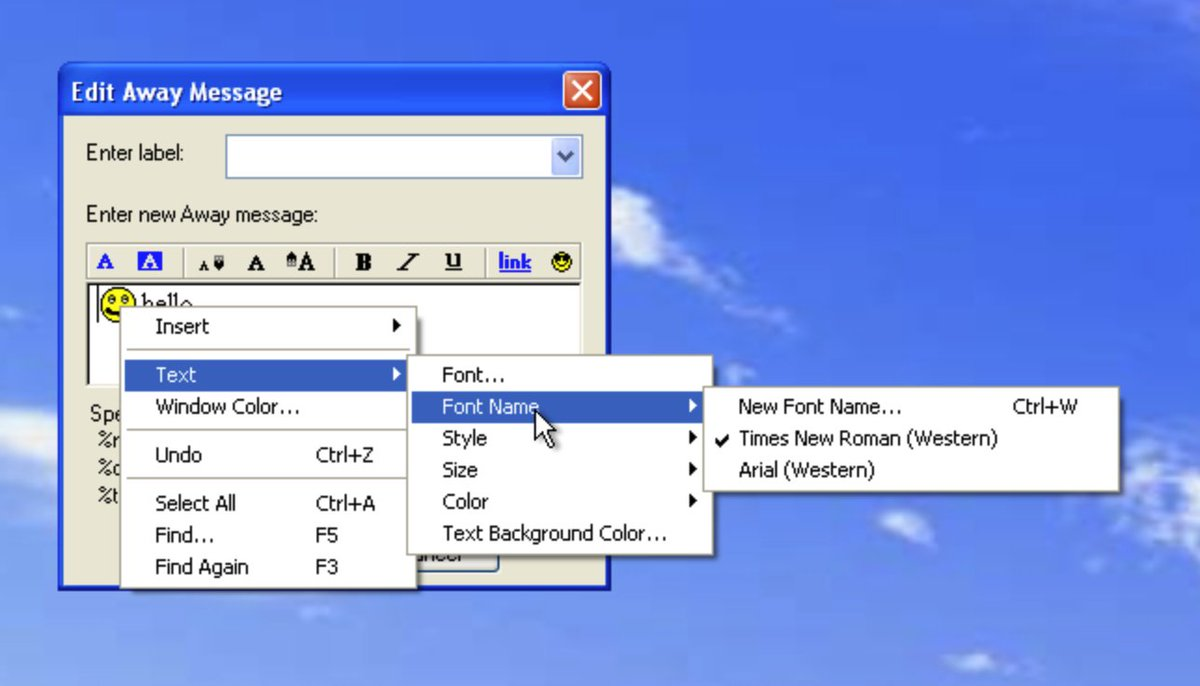
Then, I realized I don’t really need a full text editor. I can just make colors, font, bold/italic/etc apply on the entire message. Don’t let perfect be the enemy of good or something.
Turns out, however, that away messages are stored as HTML meaning AOL Instant Messenger likely uses ContentEditable for its composer. Terrifying.

Like any good project I fired up an XP virtual machine on UTM, downloaded AOL Instant Messenger 5.1, and started checking out some pixels.
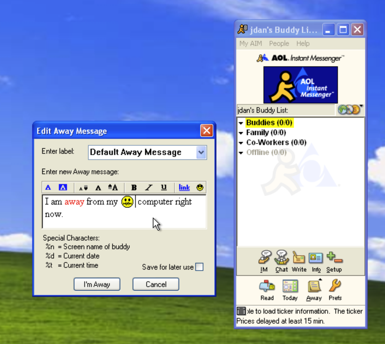
If you’re interested in modern-day AIM servers, look up “OSCAR protocol” and you’ll stumble on one. The one I used above works pretty well but unfortunately I can’t recommend because the individual who runs it is a pretty horrible person and also there seems to be a data breach over there like every 3 months.
Anyway from here I started to inspect the UI components of this box. The input states, what information persists across reloads, and even the pixel details of the icons. This work is almost hypnotic for me, it’s one of the few aspects of programming where I truly lose track of time.
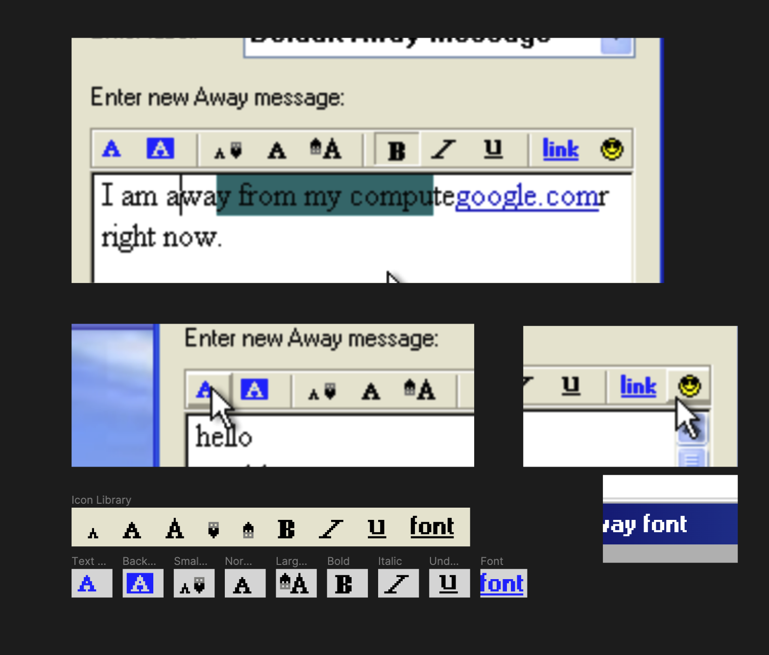
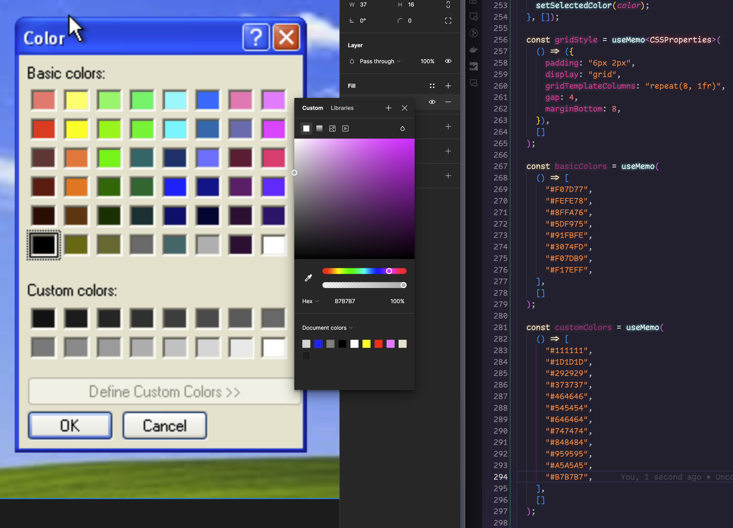
I built a nice Figma design file for myself. More than happy to share it if you contact me. Turns out “pixel art” is pretty tough there but you can get far by taking a 1x1 rectangle and duplicating it in the right positions.
The most laborious part was eye-dropping an 8x6 grid of color wells (and an additional 8x2 grid of grayscale “custom colors”). Still pretty therapeutic.
After the bones were in place I started to wire up all the state of my app, using versioned schemas to leave the door open to rich text editing, server-generated screenshots, and who knows what else.
interface EditorStateV1 {
  version: 1;
  value: string;
  fontFamily: string;
  fontSize: (typeof fontSizes)[number];
  bold: boolean;
  italic: boolean;
  underline: boolean;
  textColor: colorChoice;
  backgroundColor: colorChoice;
}

type colorChoice = ["basic" | "custom", string];
const fontSizes = [8, 10, 14, 18, 24, 32, 64];
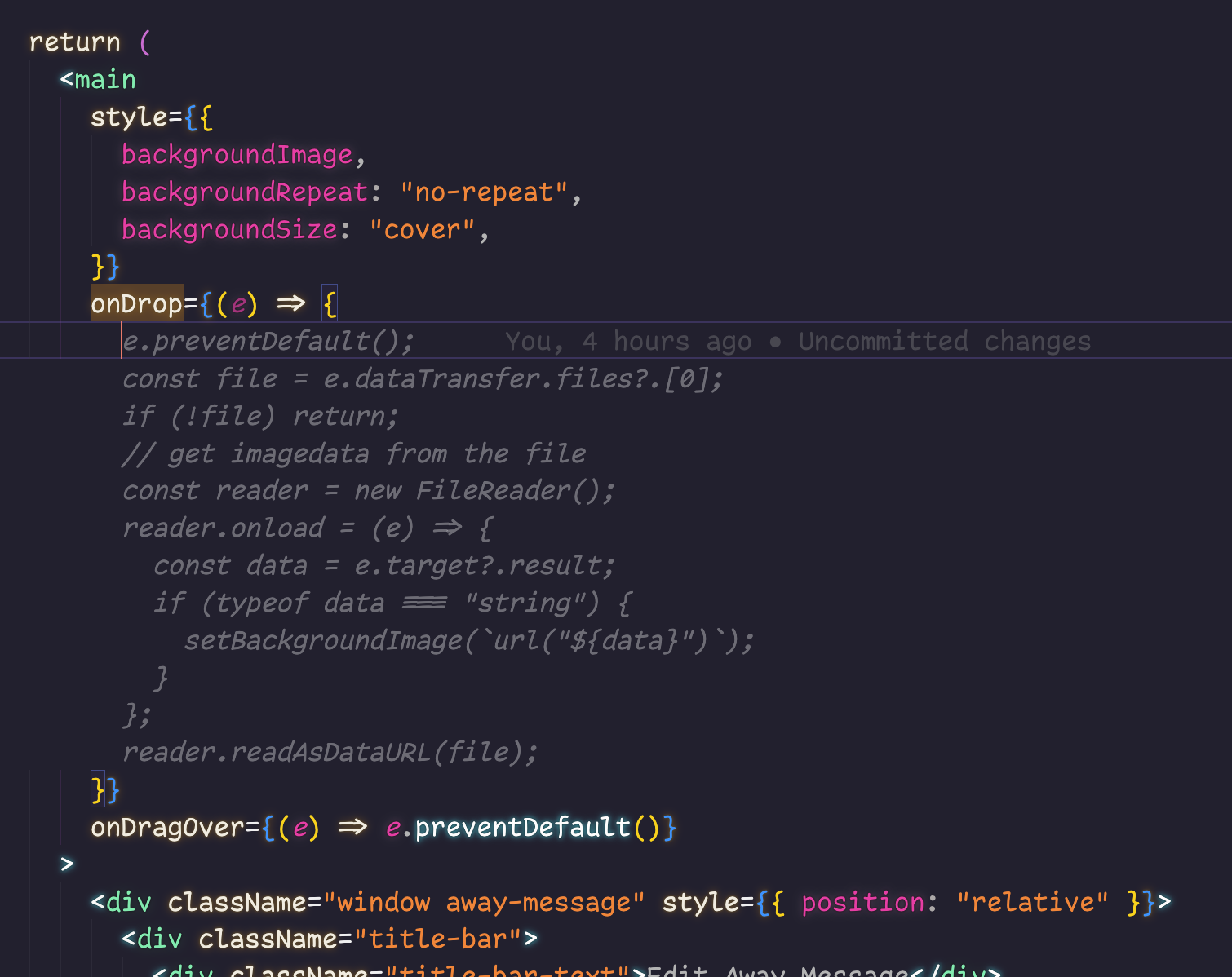
Then some finishing touches, such as allowing you to drag background images in (I can’t distribute Bliss myself) thanks to Copilot.
The result is fun, looks convincing enough, and works on phones so folks can try it out when they see it on twitter. I had a lot of fun pixel-matching as always and look forward to my next burst of nostalgia.